The Science and Art of Character Design in Animation
Character design is visual storytelling, where every detail must add to both that character and the world they live within.
It’s both a science and an art, with a good character design tapping into the base emotions and psychology of the audience. But why do some characters stick in our minds so much more than others? What makes the cast of some shows leap out of the screen and resonate with an audience, while some seem flat, bland, and ultimately forgettable. In this blog we’ll investigate some of the key principles and tricks of character design through the lens of some of my favourite animated shows and films and their captivating characters.
Silhouette
When all detail is stripped away, a character should be recognisable by its silhouette alone. Character designers will often test their creations, putting their characters in silhouette form and seeing if they still create a powerful impression. Some will even go so far as to start with a silhouette and add details after, ensuring the character’s outline is robust and recognisable from the beginning of the process.

There is no better example of a show that utilises this concept than Pokémon. Fans who grew up with the show may remember the classic “Who’s that Pokémon?” challenge that was belted out at every ad break. It speaks to the strength of Pokémon’s character design that most OG fans can easily identify the original 151 Pokémon from just their silhouette.

The designers behind these iconic creatures use a few tricks that pop up time and time again. Take Pikachu for example: his distinct lightning strike-shaped tail not only instantly identifies him, but also portrays to the audience which direction he is facing, helping to make his movement more dynamic. Another common silhouette trick is placing something unique on the head of the character, which again, shows direction. Pikachu’s ears are a great example of this and are used as a device to express his emotions throughout the anime. If you want your character to stand out, equip them with a strong silhouette as a first step!
Shape language
If you break down strong characters, you will find they are usually constructed from basic shapes. Circles, squares, and triangles each have a distinct set of characteristics that are usually associated with them. Shapes can also be used in combination if there is a more multifaceted and complex character.
Circles represent softness, friendliness, and approachability. Characters based on circles are usually kind and squishy and are rarely the villains of the story.
Squares are used to show reliability and strength. The square-shaped character will usually be the rock of the team.
Triangles are used to build dangerous, dynamic characters that are usually cunning and sneaky. Triangles are regularly used for villains or more morally ambiguous characters.
Spider-Man: Into the Spider-Verse uses the concept of shape language excellently. In the movie, a team of Spider-men and women from parallel universes assemble, each with their own brilliant design and art style. The main Spider-Man in this movie, Miles Morales, has his body constructed from an upturned triangle, highlighting his speed and athleticism, but his afro gives his head a rounder, softer appearance that alludes to the fact that he’s still just a friendly teenager who’s a little unsure of himself.

In other Spider-Man movies, Peter Parker is portrayed as a light and skinny character, who relies on his speed. In Spider-Verse Peter is built, and I mean BUILT, from strong, blocky rectangles. Peter’s a little older in this movie, and this design shows his role as the reliable leader of the cast. Cool and professional Ghost-Spider, imposing Spider-Man Noir, goofy Spider-Ham, and deceptively powerful Peni Parker are all good examples of shape language in action within character design. Be sure to implement shape language into your characters to create a memorable cast that could all carry their own spin-off movie!

Colour palette
Colour palette is something used throughout all areas of design. Colour has deep ties to culture and emotion, with designers combining colours in a palette to create a distinct feeling and set of values around a brand, outfit, product… anything. Character design is no different. A character’s colour palette is a key tool to help their personality shine.
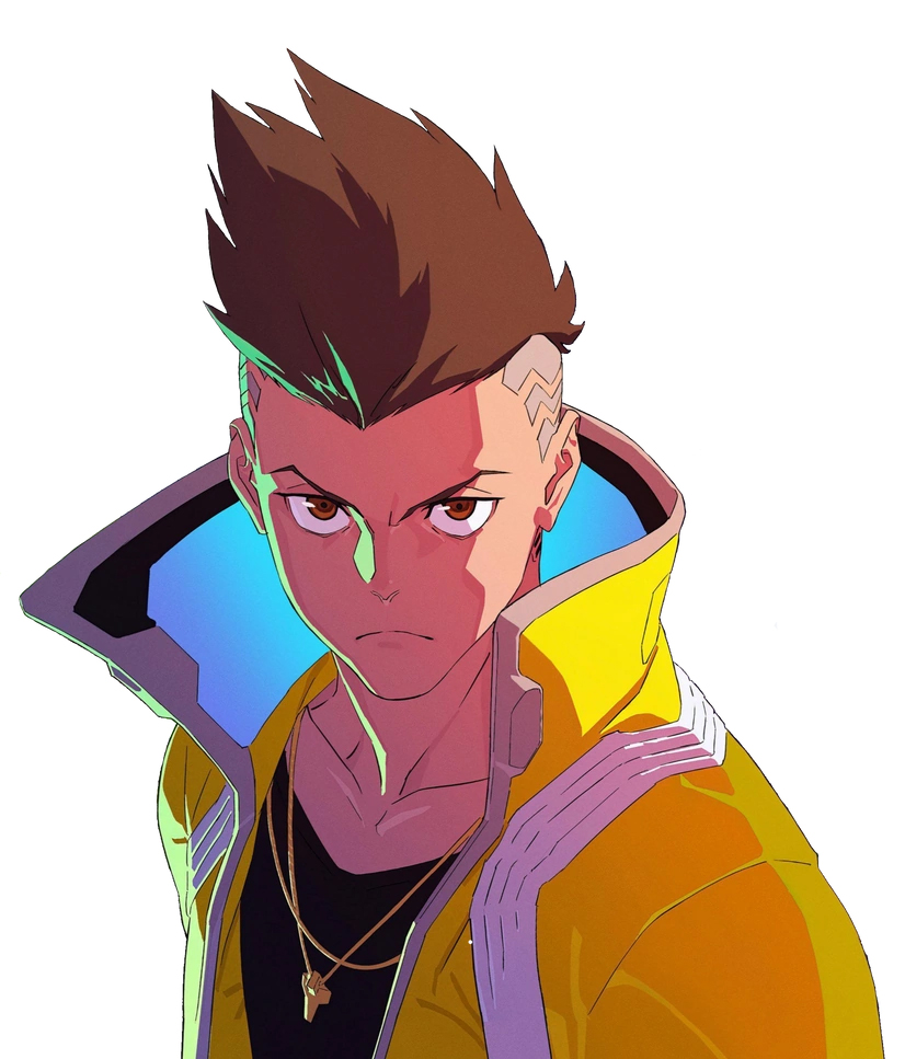
A strong character will usually have one distinct colour that represents them, with secondary colours that add contrast and complexity. Cyberpunk: Edgerunners is a show that makes use of colour palette fantastically well. Not only is colour used to bring each character to life, the world of Edgerunners itself is a feast of vibrant colours that gives the show a unique and memorable look and feel.
Main character David Martinez dons a bright yellow jacket, creating imagery of speed, energy, boldness, and ambition. This yellow is complimented by dark tones that balance the bright jacket to create a striking appearance that is visually exciting and highlights David’s youthfulness.
Lucy’s design contrasts David’s with a strong purple and white palette. This palette’s purple creates a feeling of mystery around Lucy, while the white shows her to be innocent and hopeful. Lucy is a net runner, someone able to hack into complex security systems and even technology-augmented human minds, and her palette gives her a techy, futuristic feel that matches this skillset. Another feared net runner, Kiwi, has a palette of pinks and reds, highlighting her as dangerous and powerful. The leader of the group, Maine, has a darker palette with his brown colour creating an impression of security and strength.

Colour is such a huge subject and if you would like to know more, our graphic design lead, Neil, wrote a blog dedicated to colour in branding that you can read here. If you want to boost your character’s visual personality, be sure to consider the impact of their colour and pick out the perfect palette!
Exaggeration
Exaggeration is one of the key principles of animation. Pushing an animation to the limit to make it exaggerated far beyond real-life is what makes animated media so visually appealing compared to live-action media. In character design, exaggeration is used to add visual intrigue and boost characteristics to strengthen the audience’s impression of a character.
A great case study in the importance of exaggeration in character design is The Lion King. There’s a reason the original animated Lion King remains a beloved classic and was the highest-grossing movie of 1994, while the 2019 live-action remake received a meagre 52% on Rotten Tomatoes and is now, thankfully, almost forgotten. The 2019 remake had no exaggeration. It was boring. The captivating expressions of the original cast, from the beaming Simba to the sneering Scar, were all traded off for drab, photo-realistic CG lions with all emotion stripped away.
Below is a selection of shots from the original compared to the remake. Can anyone honestly say that they can tell what the character is thinking or feeling from the stills of the remake? Sure, you can watch the movie and work out the character’s mental state from context, but take that away and you may as well be watching Discovery Channel. The original 2D animated movie had emotion PACKED into every single frame, so much so that even still images make the mental state of the colourful cast obvious.

Exaggeration isn’t limited to facial expressions and appearances in animation. Exaggeration plays a huge role in how a character moves. It helps sell the motion to the audience and creates personality. You can use the iconic time-skip shot from the “Hakuna Matata” song in the original movie as a perfect example of exaggeration, helping to show personality and emotion within movement. Simba, Pumbaa and Timon strut across a fallen tree against a beautiful backdrop of jungle waterfalls. Their heads swing from side to side as these three kings swagger through their home. The shot transitions several times, and on each occasion Simba ages and develops, until it shows him as a fully-grown lion. Still full of confidence, with his two best friends, strutting along to the song of “Hakuna Matata”. It gives a great insight into the lion he has become during this time. In the live-action remake, the movement of the characters is dumbed down, the rhythmic stepping and head swinging replaced with realistic walk cycles. Pumbaa follows Timon, Simba follows Pumbaa, time has passed, Simba has grown.

This shot says so much less than the original movie and perfectly illustrates how vital exaggeration is to a character and how dry animation can be without it. The potential of animation is unlocked when it is pushed beyond real-life, so make sure you add some exaggeration to your character’s design to really make them pop!
Symbols, icons and signs
Adding symbols, icons, or signs to your character design can add another layer of depth and mystique. This could be giving your character an object that is strongly associated with them, adding symbolism in the character’s clothing, or including a unique scar or tattoo. It’s these extra details that will send hordes of internet nerds into a frenzy, scouring the web to find the meaning behind every feature.
G.O.A.T. anime, Hunter x Hunter makes great use of this concept, with its wacky and unhinged character designs. Take the fan-favourite murderous clown-magician, Hisoka for example. Life is a game to Hisoka, and this outlook permeates every area of his design. His jester’s outfit, his purple/pink dyed hair and his meticulously applied face paint all create connotations of childishness and hedonism. These elements of the design contrast against Hisoka’s actions and his imposing physical figure to create an unforgettable, sinister impression.

Hunter x Hunter uses religious symbolism in its character designs regularly. Several characters have elongated earlobes, a reference to Buddhism. Enigmatic villain Chrollo has a St Christopher’s cross on the back of his coat, which creates a connection to Christianity. Chrollo leads a group of 12 criminals and is betrayed by one of them, a direct parallel to Jesus and his disciples.

These types of details can instantly illustrate a great deal about a character to the audience and create a more fleshed out persona. Include a few to spice up your character designs!
Animation practicality
How practical a character is to animate comes down to how much detail is packed into the design. This includes colours, outfits, folds, objects, even wrinkles and markings. 2D animation is a painstaking task, with animators drawing thousands of frames to create the illusion of movement. The more detail a character has, the more time it takes to draw, and the more an animation studio will struggle to create a fluid, expressive animation within budget and time constraints.
An example of a show that has a whole cast of highly animatable characters is Avatar the Last Airbender. Avatar makes excellent use of all the character design principles outlined in this blog so far, while also keeping the designs simple and elegant. With less detail, every element of the design needs to be strong enough to create a lasting impression on the audience. Avatar makes great use of colour palette, shape language and symbolism, with the creators making excellent use of hairstyle and markings on the body to illude to a character’s background, personality or past.

This allowed the animators to create stunning, fluidly animated action sequences throughout the show’s 3 seasons. There is so much personality in the movement of every character in ATLA, from the springy Aang to the sturdy uncle Iroh, each character’s motion is aided by their simplicity. If you want to make sure you can fully bring your character to life through animation, ensure you keep them simple enough to draw over and over again!
Take a look around
Whether in 2D or 3D, master character designers use each of these techniques to create characters that the audience will love, hate, but most importantly, never forget. Character design is a broad, complex subject that has entire university courses dedicated to its study. I hope this blog has begun to scratch the surface of this fascinating area of design and shone a light on some of the techniques behind all the iconic characters we know, from SpongeBob to Batman. When you next see your favourite character on screen, take a second to think about the vast amount of thought that has gone into every colour, shape, symbol, and detail.

